
Using Tailwind for styling with ToDesktop Builder

Founder of ToDesktop
At ToDesktop, we've always had the ability to add Custom CSS to apps built with ToDesktop. We came up with a super simple solution that works quite well. ToDesktop adds a todesktop class to the html element on each page of your app. You can use this to identify when your app is being run as a desktop app.
.announcement {
  background-color: hotpink;
  /* other styles... */
}

/* Hide the announcement in the desktop app */
html.todesktop .announcement {
  display: none;
}
While this approach suits many apps, an increasing number of developers are now opting for styling tools like Tailwind.
Adding Tailwind support
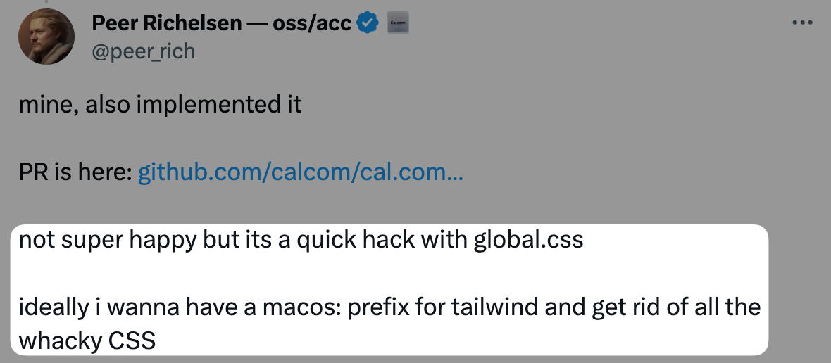
Peer from Cal.com reached out and asked if we could add support for tailwind modifiers like todesktop:hidden and mac:rounded-lg to quickly style up components without resorting to a global.css file.
This was a great idea and I was keen to see if we could make it work.
Modifiers in Tailwind control when a particular utility should be applied. For example, the hover: variant applies a utility on hover. I needed to find out if we could introduce custom variants like todesktop: that would activate only when the app is running inside the ToDesktop environment. So, for example todesktop:text-xl would only apply the text-xl class when the app is running on ToDesktop.
Creating a Tailwind plugin
It wasn't immediately obvious how to add support for these modifiers. I was able to find plenty of examples for creating plugins for themes/compononents/utilities but nothing for adding support for modifiers. I stumbled on a blog post from Charlie Gerard that showed me how to create a variant plugin.
I wanted this to be backwards compatible with all previous versions of ToDesktop Builder so I needed to rely on the todesktop class that we already add to the html element.
So, the plan is pretty simple:
- Define a custom
todesktop:variant - This variant should modify the selector so that it only applies when the
htmlelement has thetodesktopclass
To achieve this, the following code can be used:
const plugin = require('tailwindcss/plugin');

plugin(function ({ addVariant, e }) {
  addVariant('todesktop', ({ modifySelectors, separator }) => {
    modifySelectors(({ className }) => {
      return `html.todesktop .${e(`todesktop${separator}${className}`)}`;
    });
  });
});
Adding support for macOS, Windows and Linux
Next, I expanded the plugin to include other ToDesktop-specific scenarios, like differentiating between macOS, Windows and Linux environments (mac: and windows: and linux variants). This would allow developers to tailor their app's UI to each platform's idiosyncrasies.
Here are the classes that are added to the html element when the app is running on ToDesktop:
| Class name | Platform (operating system) target |
|---|---|
.todesktop-platform-win32 |
Windows |
.todesktop-platform-darwin |
macOS |
.todesktop-platform-linux |
Linux |
In hindsight, I should have used windows instead of win32 and mac instead of darwin. But this decision was made a long time ago and I didn't want to break backwards compatibility. But this Tailwind plugin allows us to use more friendly names so I created a mapping from the ToDesktop class names to the Tailwind variants:
const platformMap = {
  darwin: 'mac',
  win32: 'windows',
  linux: 'linux'
};
Now, I can iterate over this map and add variants for each platform:
Object.keys(platformMap).forEach((platform) => {
  const variant = platformMap[platform];
  addVariant(variant, ({ modifySelectors, separator }) => {
    modifySelectors(({ className }) => {
      return `html.todesktop-platform-${platform} .${e(`${variant}${separator}${className}`)}`;
    });
  });
});
Real world example
Previously, ToDesktop customers had to add a global.css file to their app (or resort to inline <style /> tags) to make style changes when the app was running on ToDesktop.
Here's an example from Cal.com. They have a header component that previously looked like this:
<style>
  html.todesktop aside header {
    margin-top: -12px;
    flex-direction: column-reverse;
    -webkit-app-region: drag;
  }
</style>

<header className="items-center justify-between md:hidden lg:flex">
  <!-- ... -->
</header>
But, now you can use the todesktop: variant! Peer was quick to jump on this and he added support for our new variants to his app. Cal.com is open source so you can take a look at the PR where Peer added support for the new variants was added over on GitHub.
Now, Peer was able to remove the global styles and his header component looks like this:
<header
  className="todesktop:-mt-3 todesktop:flex-col-reverse todesktop:[-webkit-app-region:drag] items-center justify-between md:hidden lg:flex"
>
  <!-- ... -->
</header>
Use it with ToDesktop Builder today
Our Tailwind plugin is open-source and can be used with any app built with ToDesktop Builder. Check it out and install it over on GitHub.